The Science Behind the Numbers
Core explainers
Latest science articles
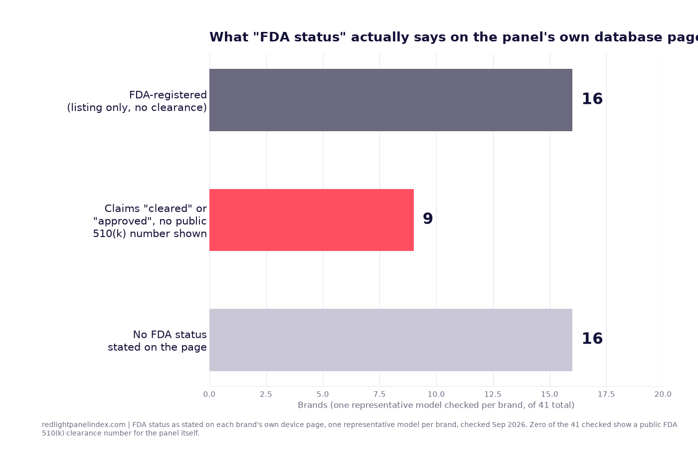
'Medical Grade' Red Light Panels: An Audit of the Claim
Medical grade
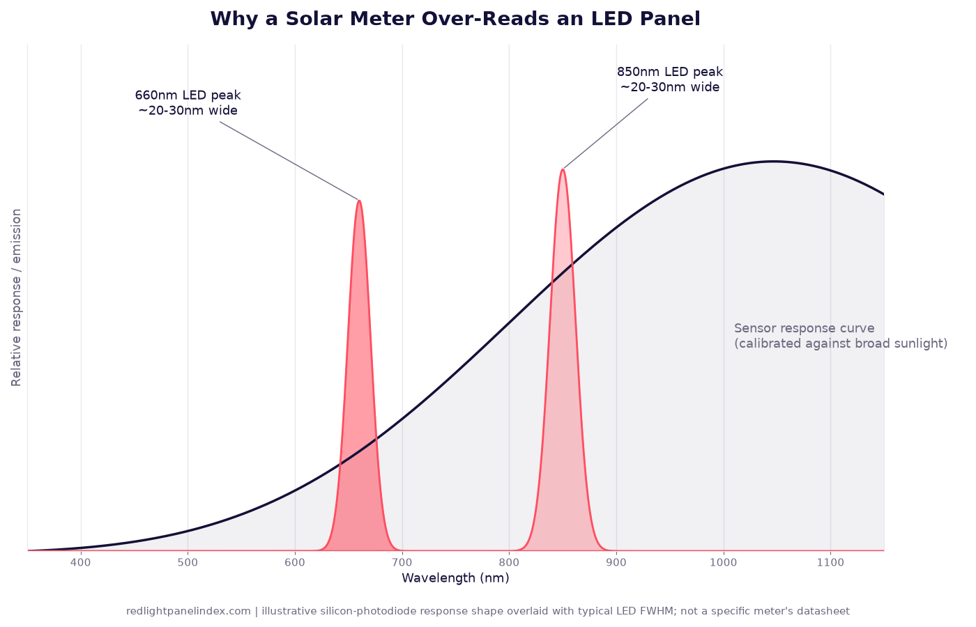
What a Solar Power Meter Measures (And Why Brands Use One)
A solar power meter is a broadband silicon-photodiode sensor built for sunlight, not narrow LED peaks, and that mismatch is why its readings run high.
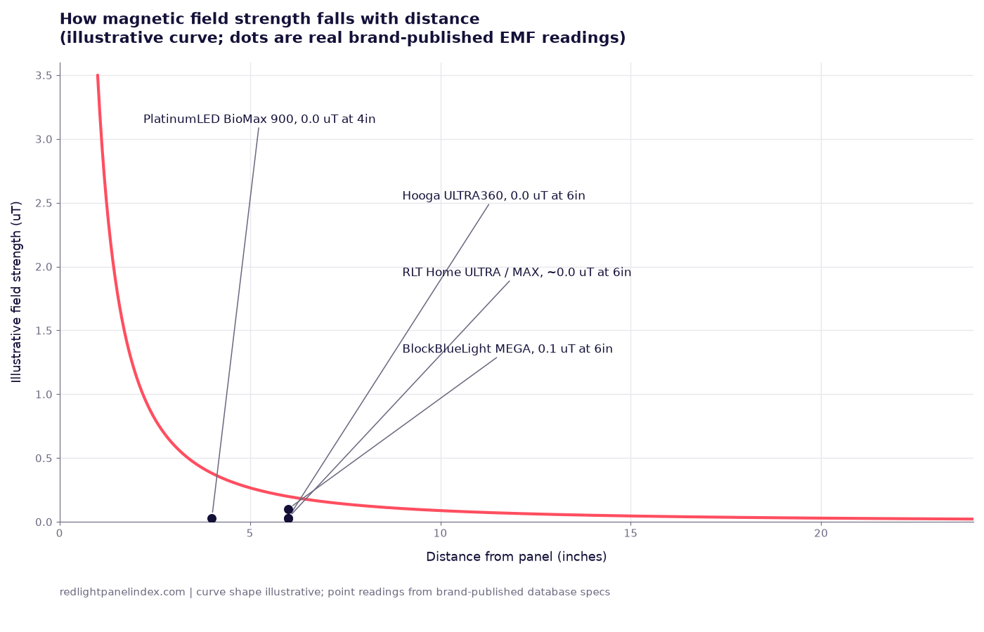
EMF in Red Light Panels: Claims vs Measurements
What kind of EMF a panel produces, how it falls with distance, how brands measure it, and what this site's database shows brand by brand.
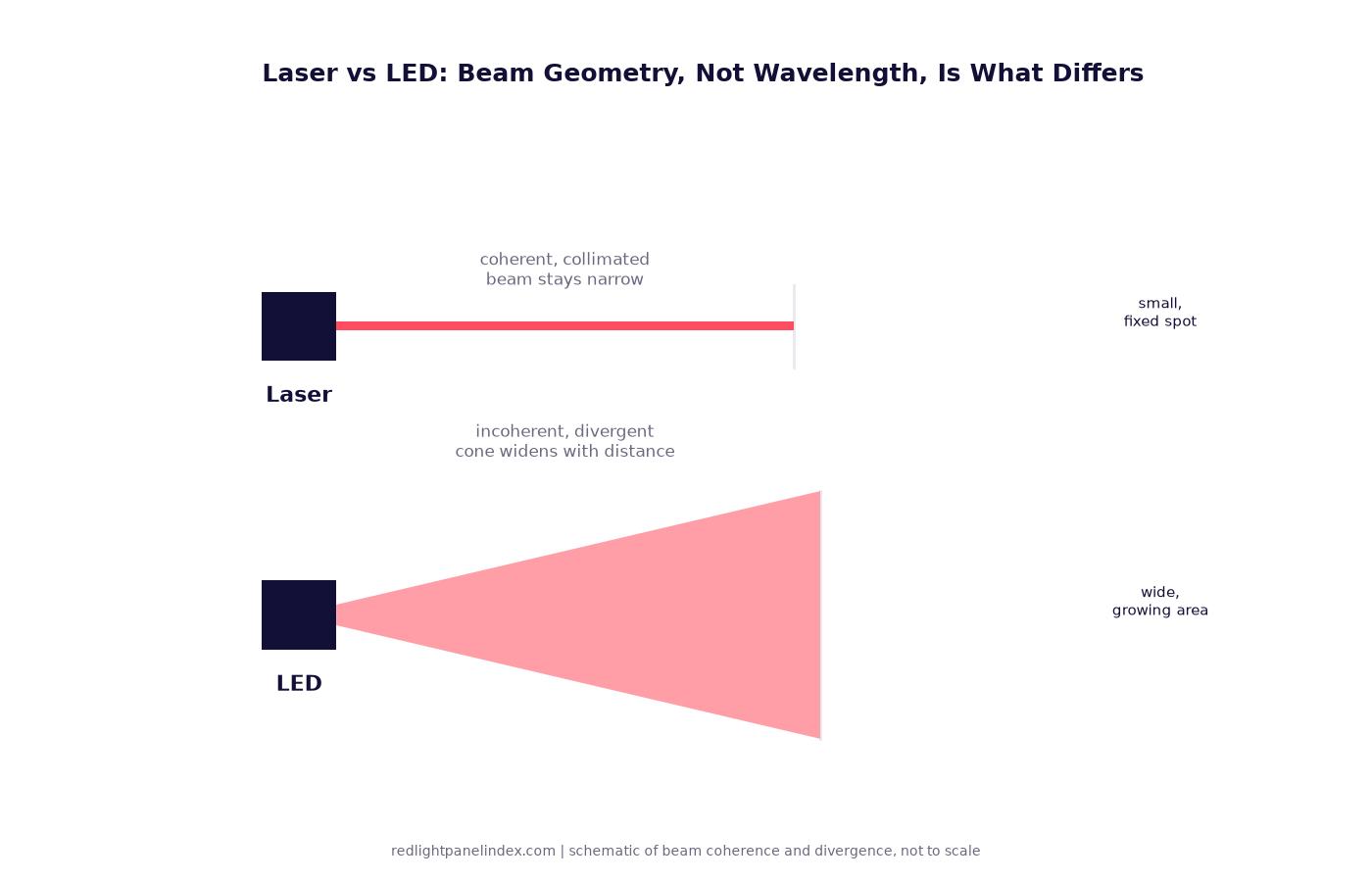
LED vs Laser for Red Light Therapy: Does Coherence Matter?
Most trial evidence started with lasers; most home devices use LEDs. What coherence is, and whether it changes tissue outcomes.

Pulsed vs Continuous Red Light: What the Evidence Says
A 2010 review of pulsing in low-level light therapy found mixed, condition-specific results and no general advantage over continuous light.
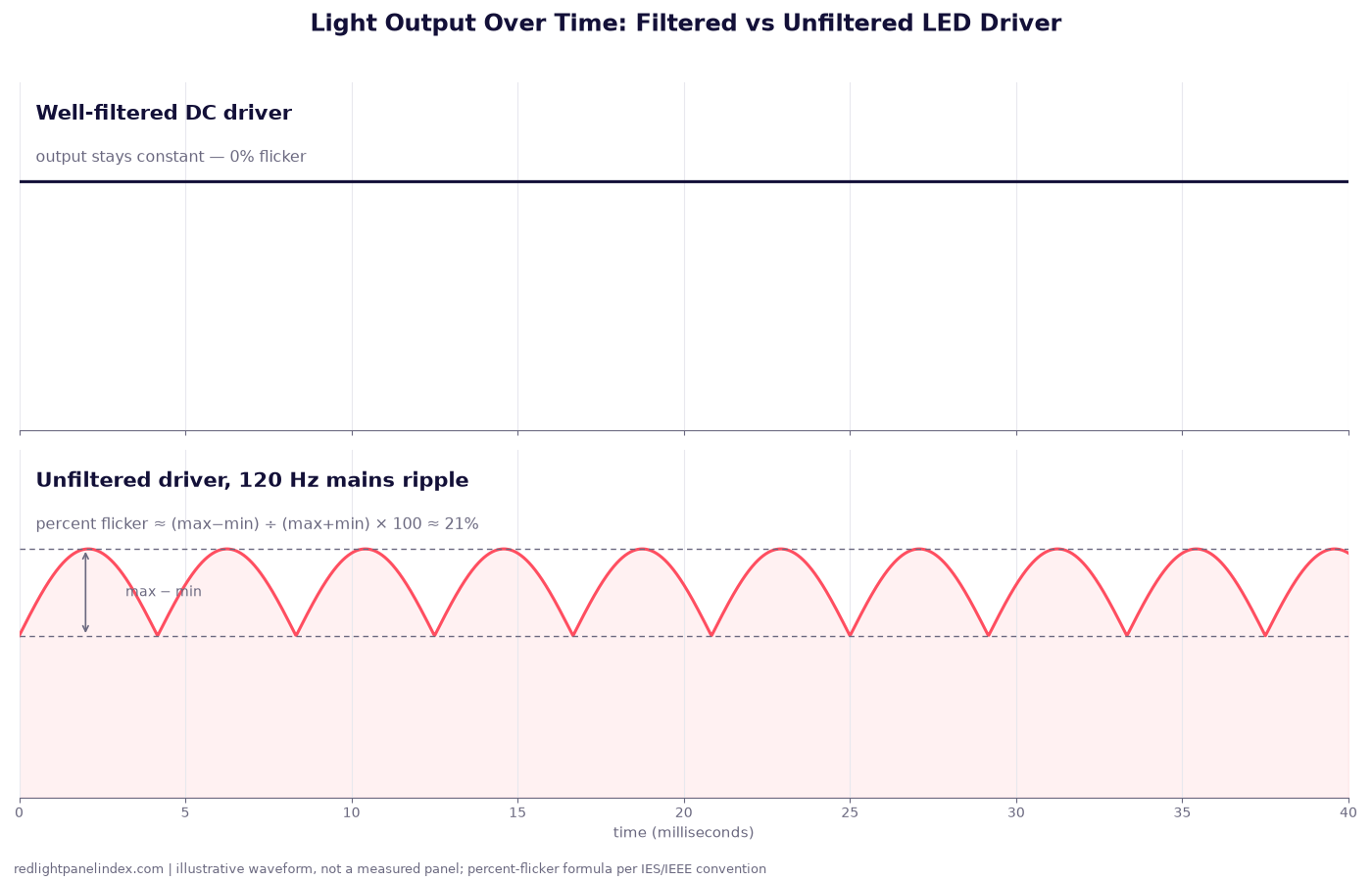
Flicker in LED Panels: What It Is and Whether It Matters
Percent flicker and flicker index explain the rapid brightness cycling a driver can leave in LED output, and why it is a comfort issue, not a therapeutic one.
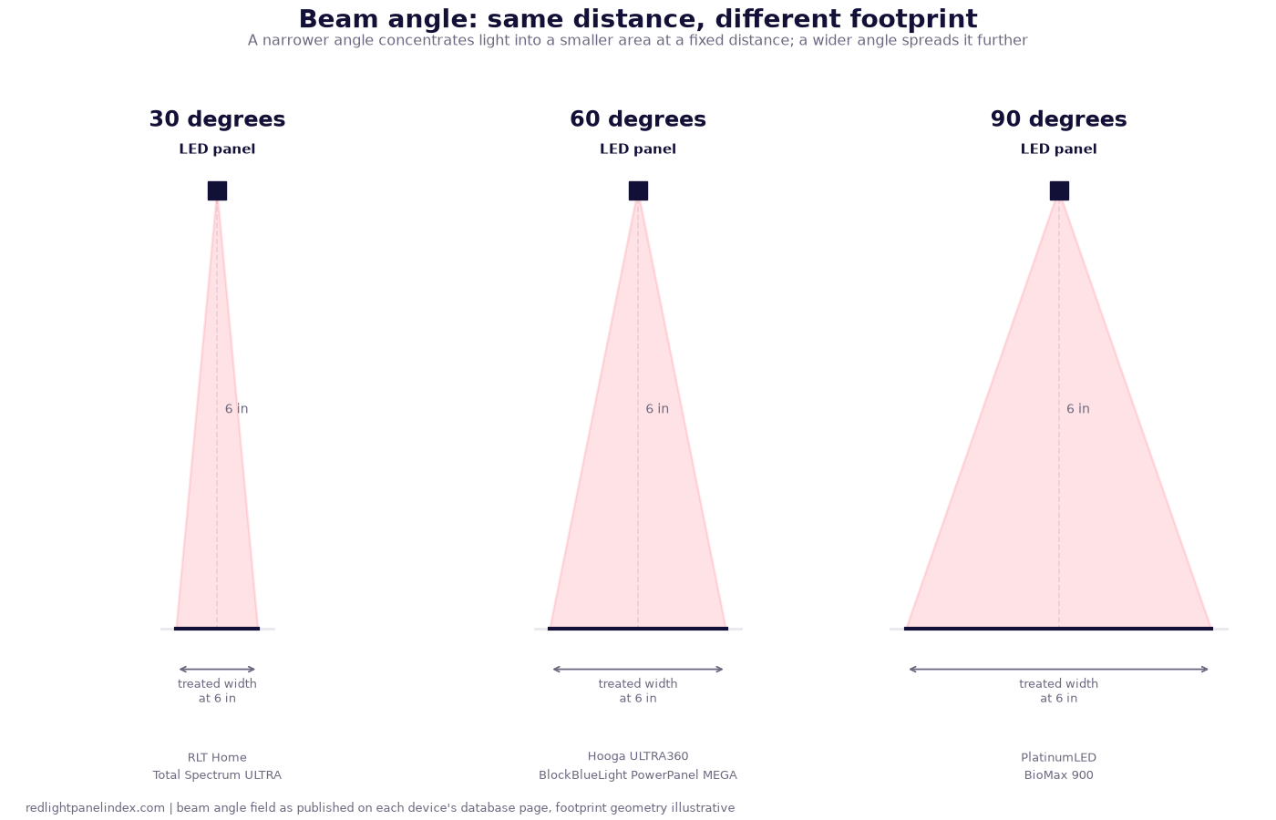
Beam Angle Explained: 30 vs 60 vs 90 Degrees
Beam angle sets how tightly an LED panel's light concentrates at a given distance, and how much area it covers. What 30, 60 and 90 degrees trade off.
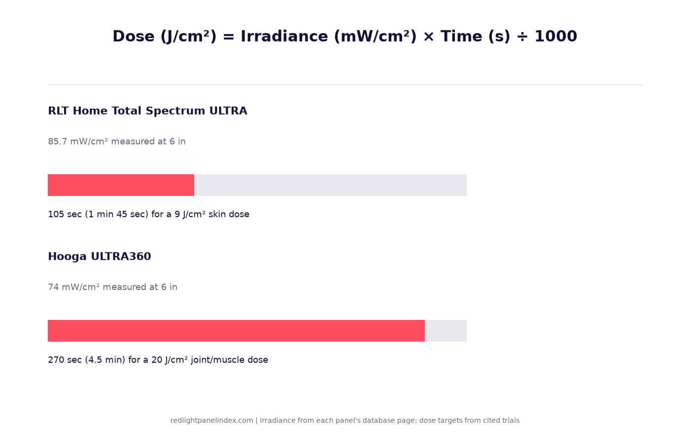
Joules per cm2 Explained: How Red Light Dose Is Measured
J/cm2 is irradiance times time divided by 1000. The formula, two worked examples, and the doses actually used in the trials this site cites.
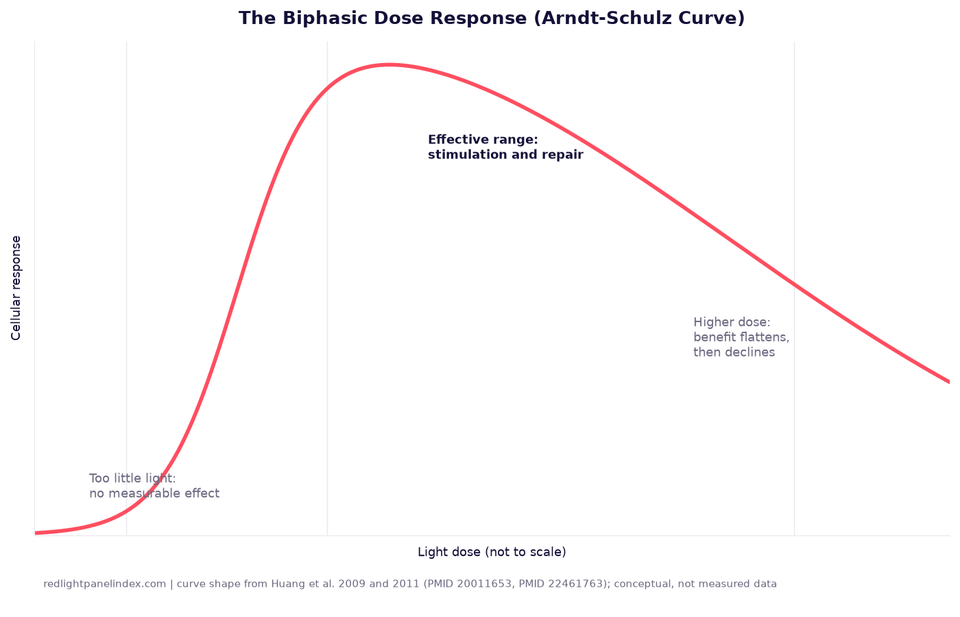
The Biphasic Dose Response: Can You Overdose on Red Light?
Two mechanistic reviews describe the Arndt-Schulz curve in light therapy - why more light does not mean a better result, and where that ceiling actually comes from.
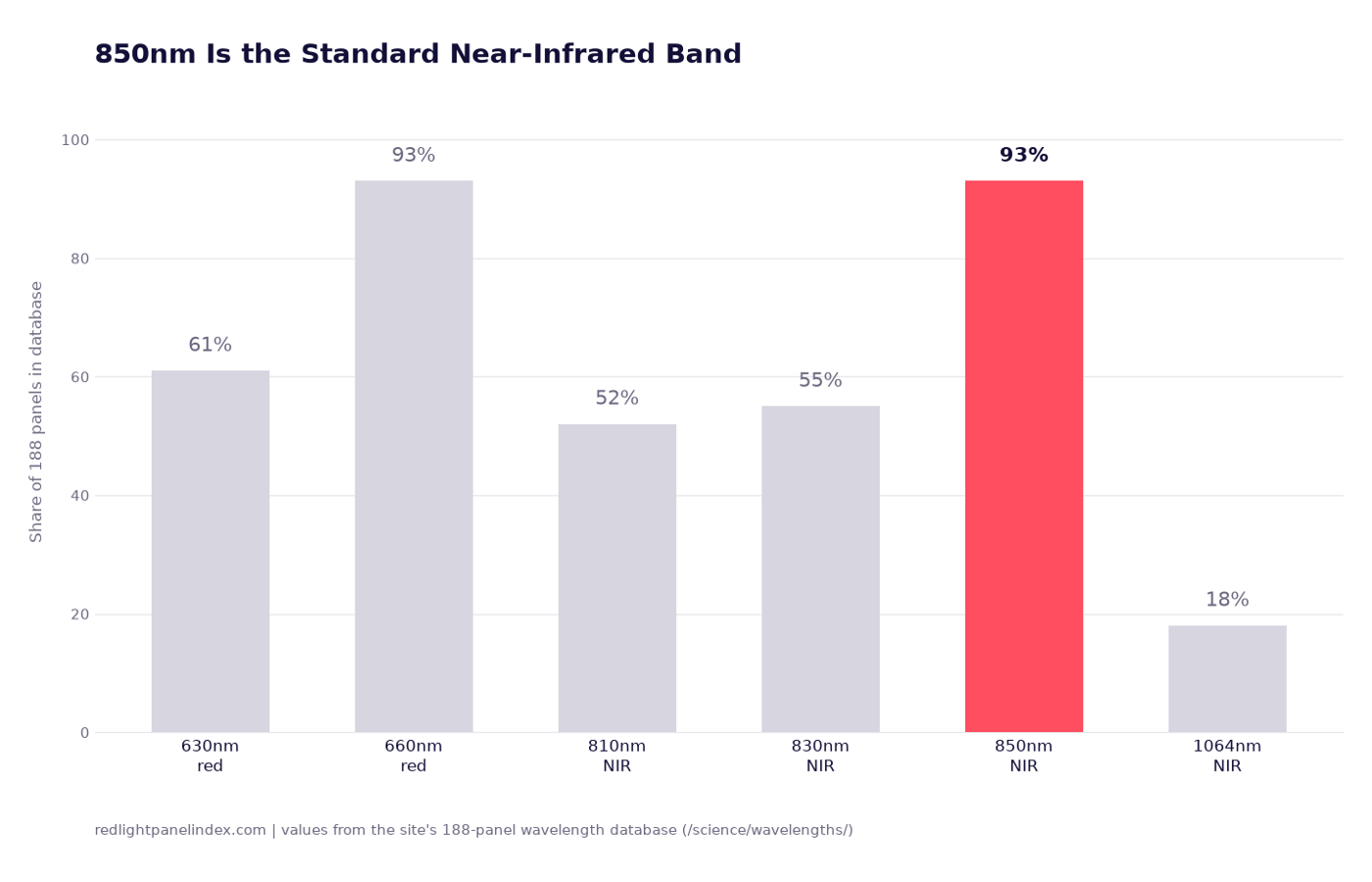
850nm Near-Infrared: The Standard NIR Band
850nm sits on 93% of red light panels, tied with 660nm. The near-infrared default, the trials behind it, and the depth it actually reaches.
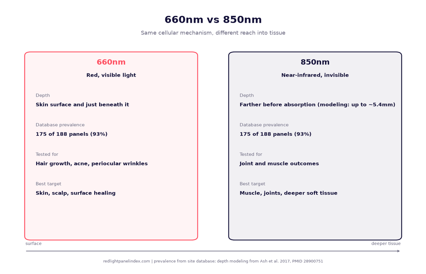
660nm vs 850nm: Which Wavelength Do You Actually Need?
The two most common panel wavelengths compared: what depth each reaches, what each was tested for, and how panels split power between them.
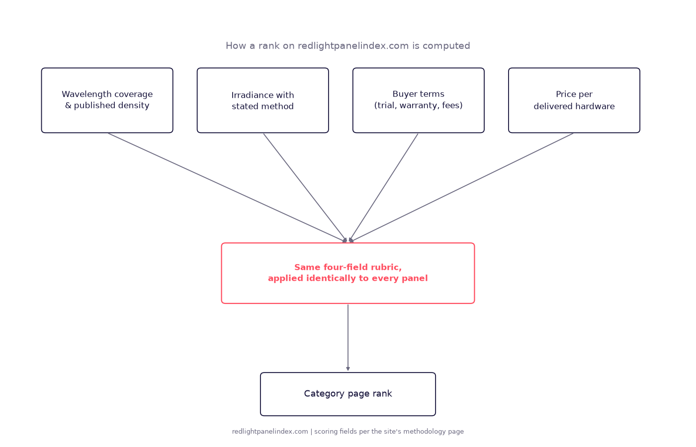
How the Rankings on This Site Are Computed
The four scoring fields behind every ranking on this site, how a method-labeled figure beats an unlabeled one, and a worked example from one list.
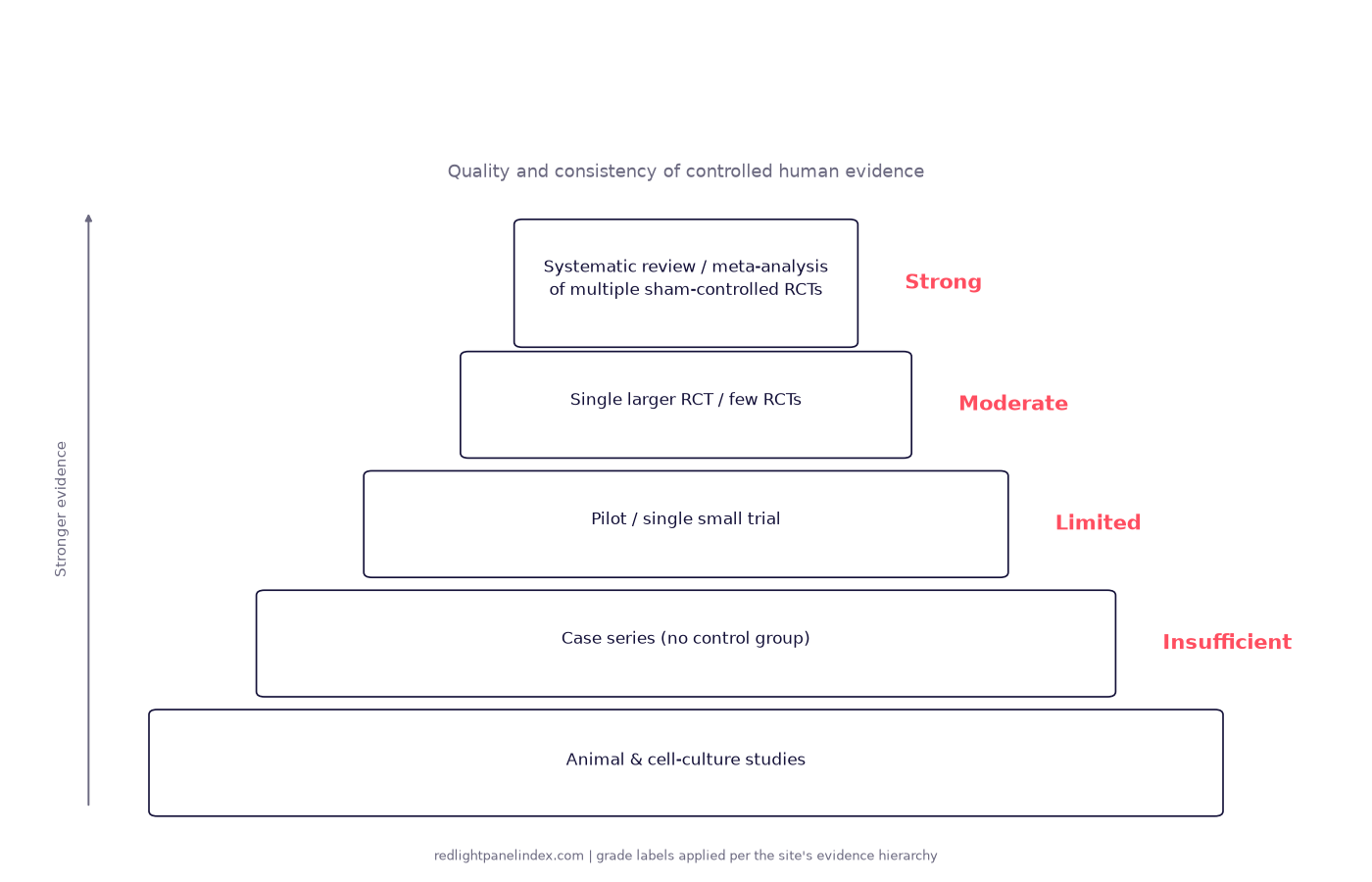
How This Site Grades Evidence: Strong to Insufficient
The four evidence grades this site uses, the trial hierarchy behind them, and one worked condition example at each grade, from knee pain to weight loss.
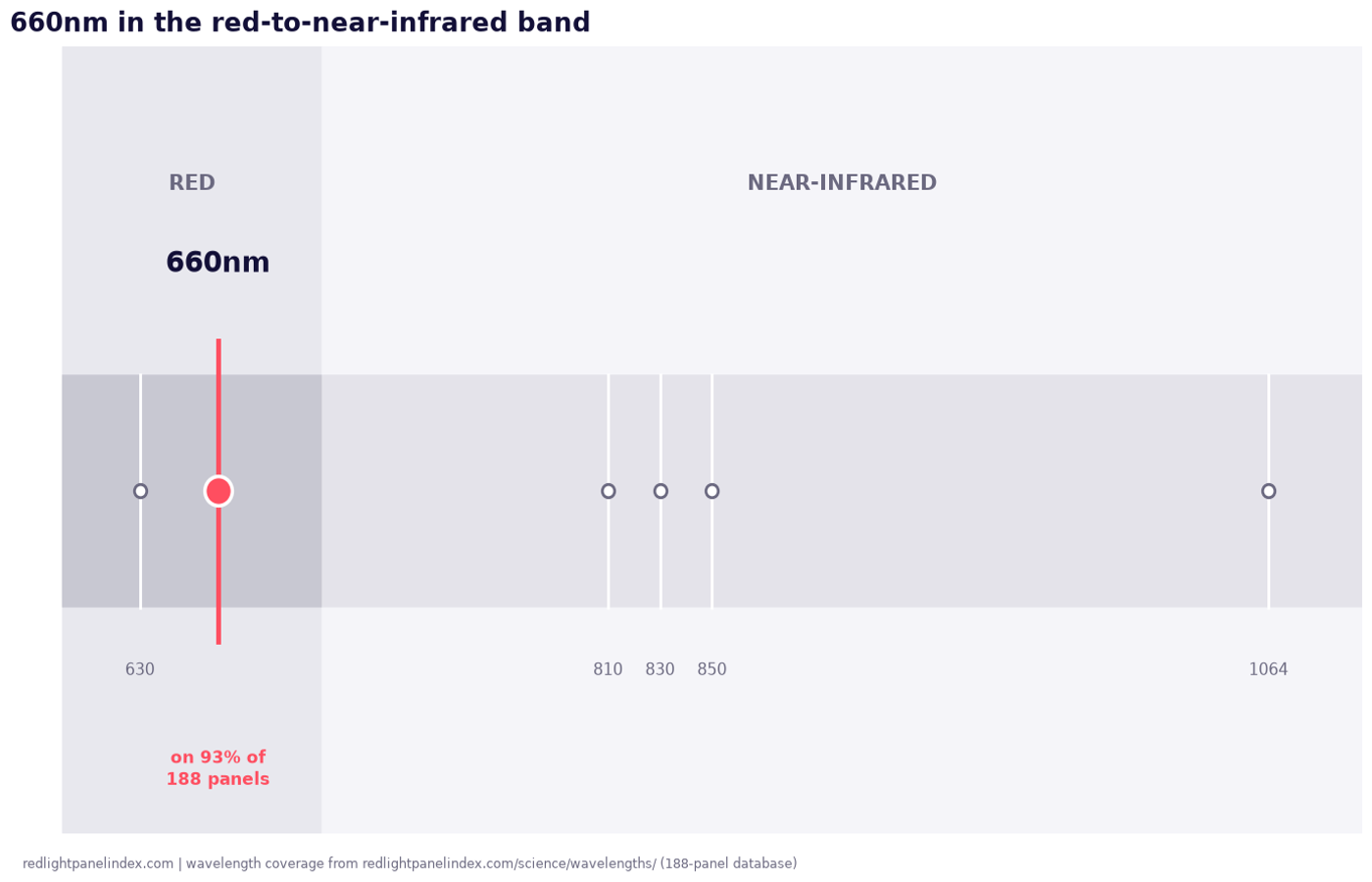
660nm Red Light: The Workhorse Wavelength
660nm sits on 93% of red light panels. What the wavelength does, the trials that used it, and how it differs from a nearby label like 655nm.
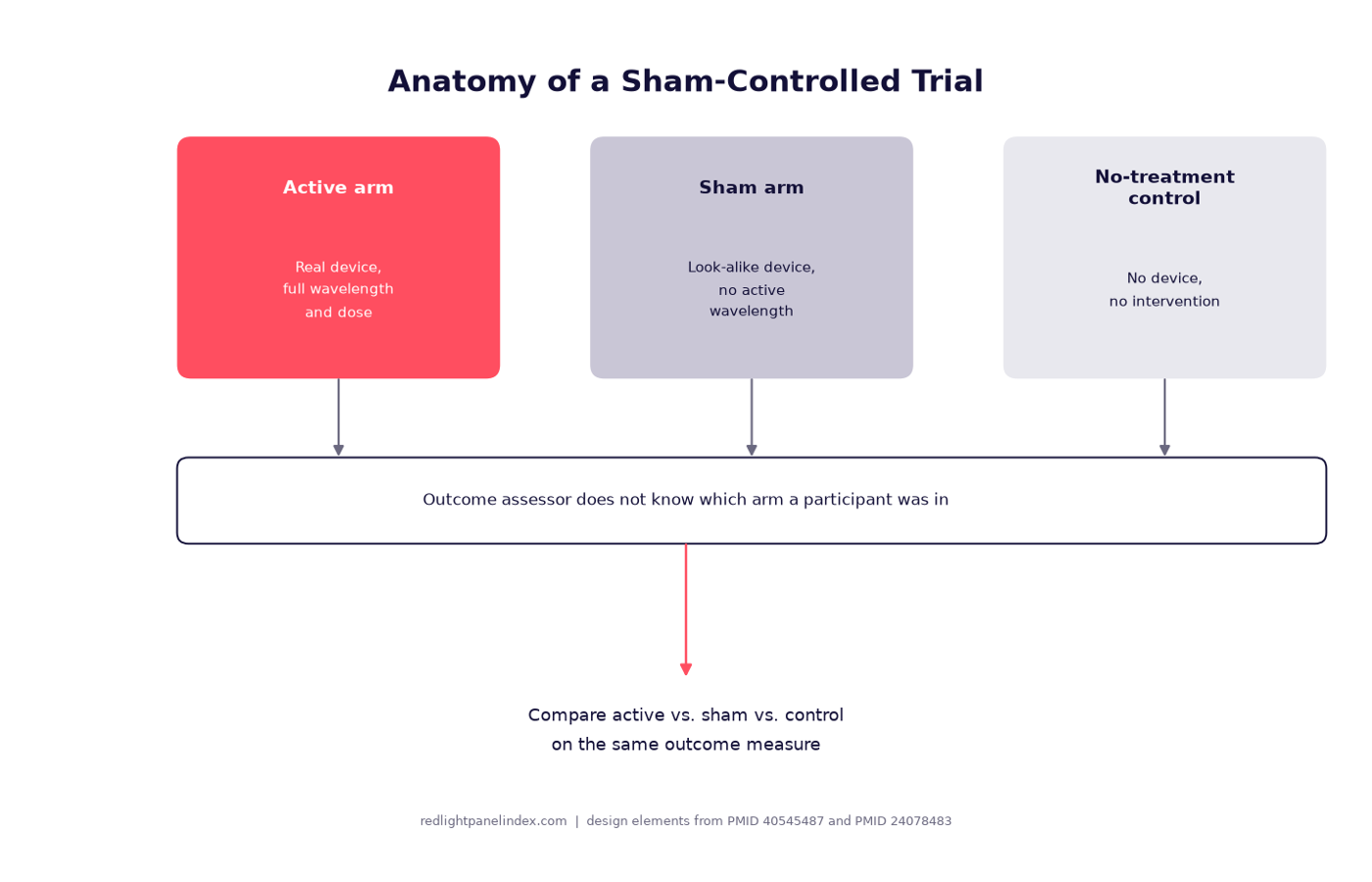
Sham-Controlled Trials: How to Read a Red Light Study
What a sham-controlled trial is, why blinding is hard when the light itself is visible, and how to read an abstract's claims against its design.
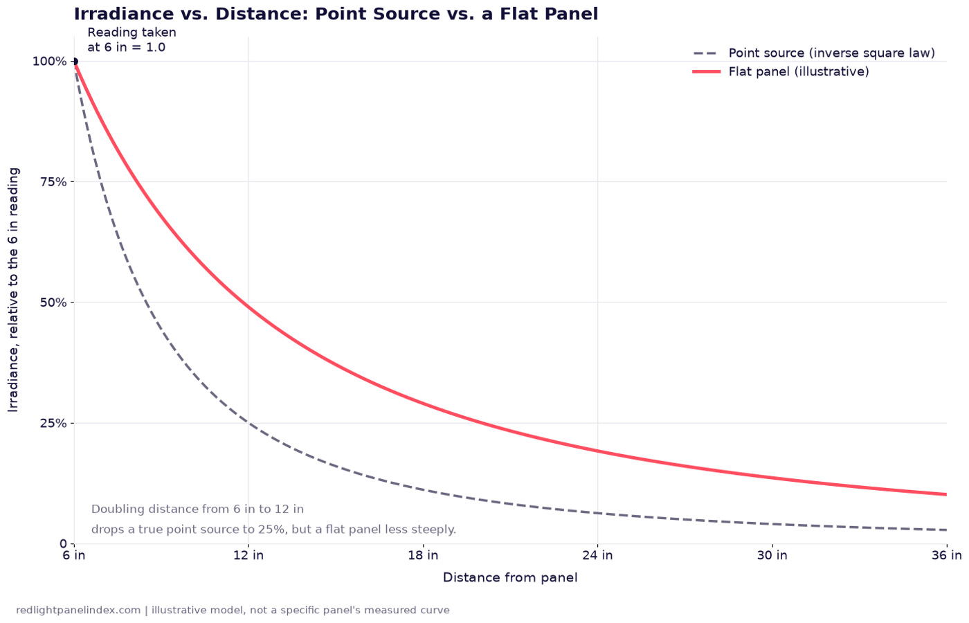
Inverse Square Law: Why It Only Half Applies
The inverse square law predicts how fast light fades with distance, but a flat panel is not a point source, so it fades slower than the law says up close.
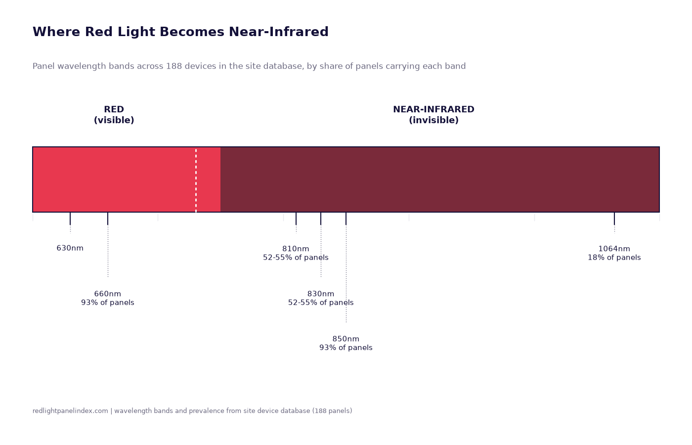
Red Light vs Near-Infrared: What Is the Difference?
Red (about 600-700nm) and near-infrared (700-1100nm) trigger the same cell mechanism but reach different depths. What separates the two bands.
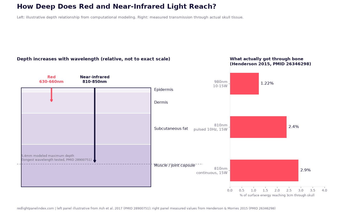
How Deep Does Red and Near-Infrared Light Penetrate?
What computational modeling and skull-transmission studies actually report about light penetration, and why "penetrates two inches" is not supportable.
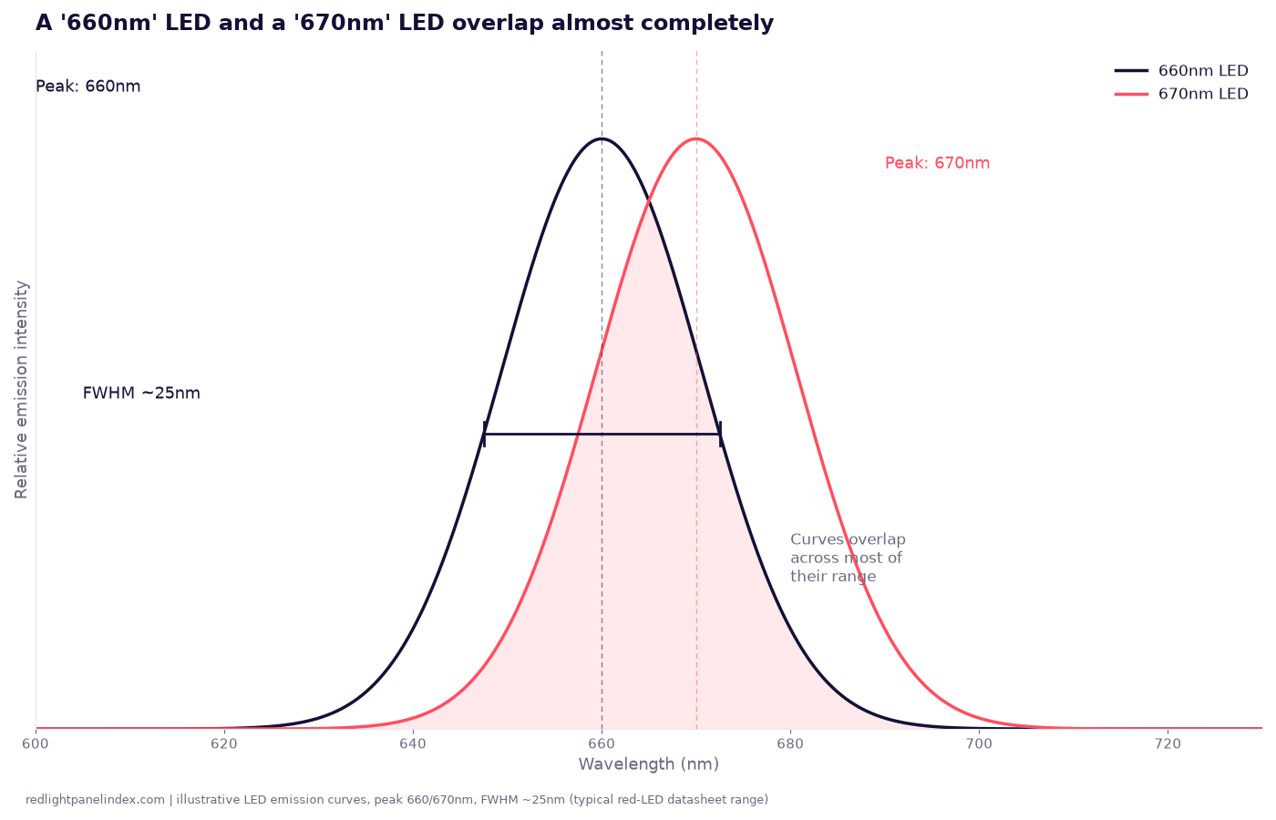
Peak Wavelength and FWHM: What '660nm' Really Means on a Spec Sheet
A 660nm LED does not emit a single wavelength. Peak wavelength and FWHM explain why panels labeled differently can overlap almost completely.
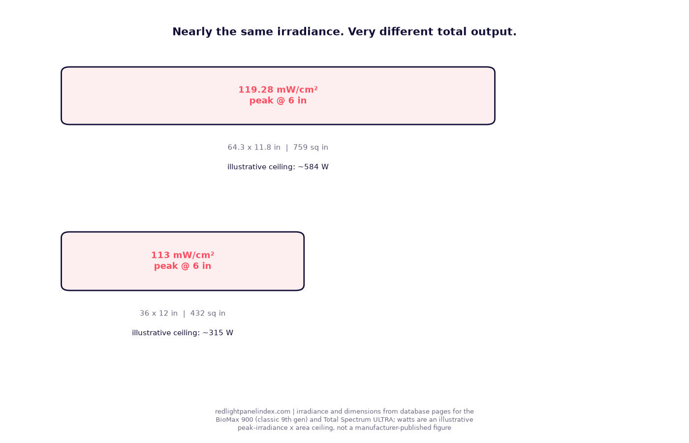
Irradiance vs Total Power: Which Number Matters?
Irradiance tells you the dose at one spot; total power tells you whole-panel output. Why they diverge, and which one to compare when panels differ in size.
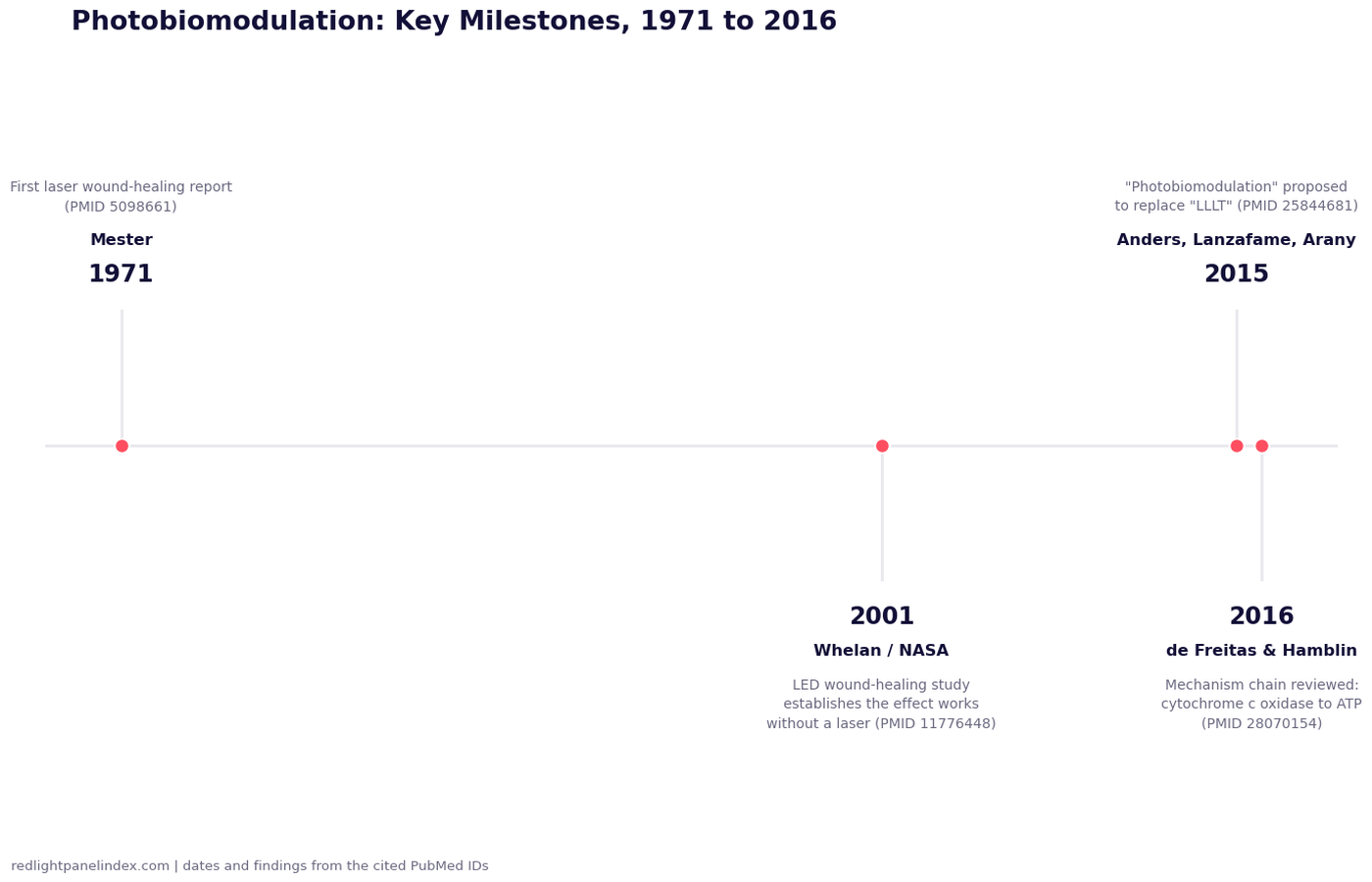
What Is Photobiomodulation? (And Why It Replaced "LLLT")
Photobiomodulation replaced "LLLT" in 2015 once LED research showed the effect works without a laser. The history, the studies and the mechanism.